
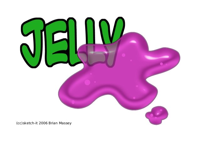
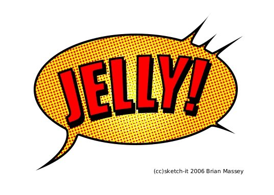
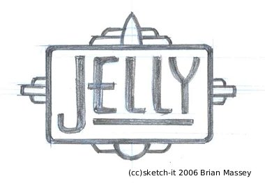
I was asked to create 3 logos for Jelly... one in a comic style, one pop art and a noir style. I spent a little more time on these than normal because I took soooo long to fill the request (I have an excuse... really). Anyway, the "comic" style ended up having a very pop art feel anyway so I think that's sort of interchangeable, the "pop" style turned out to be, well, a blob of jelly on the word "Jelly" and I interpreted the "noir" style in an art deco/diner sign style. I'm a little heartbroken over that one... I actually rendered it digitally like the other two but when I created the one with the blob of jelly I accidentally saved over the noir one... which was done in black, white and sepia tones. Oh well... for the pay I wasn't about to recreate it LOL... Anyway, I hope Amit likes 'em
RUN!
ReplyDeleteDon't WALK!
FROM...
The BLOB!
It consumes everything. Even really cool deisgner, custom artwork that is such a deal they oughta be talking about it on boing boing.
My condolences Mr. Massey. My it rest in peace.
I'm not sure if that was a compliment LOL... I'll take it that way. Either way it was funny :)
ReplyDeleteLove that middle one... quite the bang for the buck with these three!
ReplyDelete" Love that middle one... quite the bang for the buck with these three!"
ReplyDeleteOr three bucks... as the case may be. Thanks.
These are awesome Brian! Thanks so much!
ReplyDelete